Is Boris Johnson colourblind?
The problem of accessibility when using figures and graphs in research
Colours are used all the time when we use figures and graphs to communicate. In many ways, this a thoroughly modern problem. In the past, there were more limitations when it came to presenting colours in print. There was a significant cost associated with colour printing and so any graphs and diagrams were presented in a way that was, as a side-effect, super-helpful for those of us with more limited colour vision. Newspapers, medical journals were all in black and white. And when it came to different lines on graphs they were often dotted or dashed or some other combo that was easy to see.
I'm old enough to remember when it was remarkable for a newspaper to have colour pictures. The first newspaper that was fully colour was the Today, launched in 1986. It took more or less 20 years for the others to catch up. The Guardian launched as full colour in 2005, the Mirror in 2007, and The Times in 2008. I would argue that the noughties marked the point where accessibility for people with colour blindness took a downturn.
Since then, modern printing technology means that colour is easily accessible to anyone - with the ironic impact that the content they provide is often far less accessible to us 1 in 12ers/1 in 200ers.
Even worse, people are doing far more with screens. This often has hideous results, from the colourblind perspective, and accessibility for figures and graphs can be grim.
The Prime Minister and the dark red line
Which leads us to a key moment in recent history when science hit the bump of colourblindness and then carried blithely on. Is Boris Johnson colourblind? The Chief Scientific Officer, Sir Patrick Vallance, was recently giving evidence at the Covid-19 inquiry.
Here is his diary entry:
The key sentence from Vallance’s notebook: “he asks questions like ‘which line is the dark red one’ - is he colour blind?”1
I have no idea if Boris Johnson is colourblind and I am inclined to think Vallance was being somewhat facetious. But it is exactly the kind of problem I might have. I have to say that if some academic puts up a graph with a dark red line I am going to have one hell of a job distinguishing that line from other dark lines. The red doesn’t come through and it just doesn’t ‘pop’ in the way I suspect people with normal colour vision experience it. Dark red is often a poor choice of colour for accessibility - though it does depend on the overall palette used.
Patrick Vallance is the Chief Scientific Officer presenting some of the most critical scientific evidence to the most important man during a global crisis. Vallance knows about colourblindness and yet there seem a decent possibility that they concocted graphs that are not fully accessible. Brilliant. It speaks volumes for an ongoing disregard for colourblindness and its impact.
More dismal Covid colour graphs
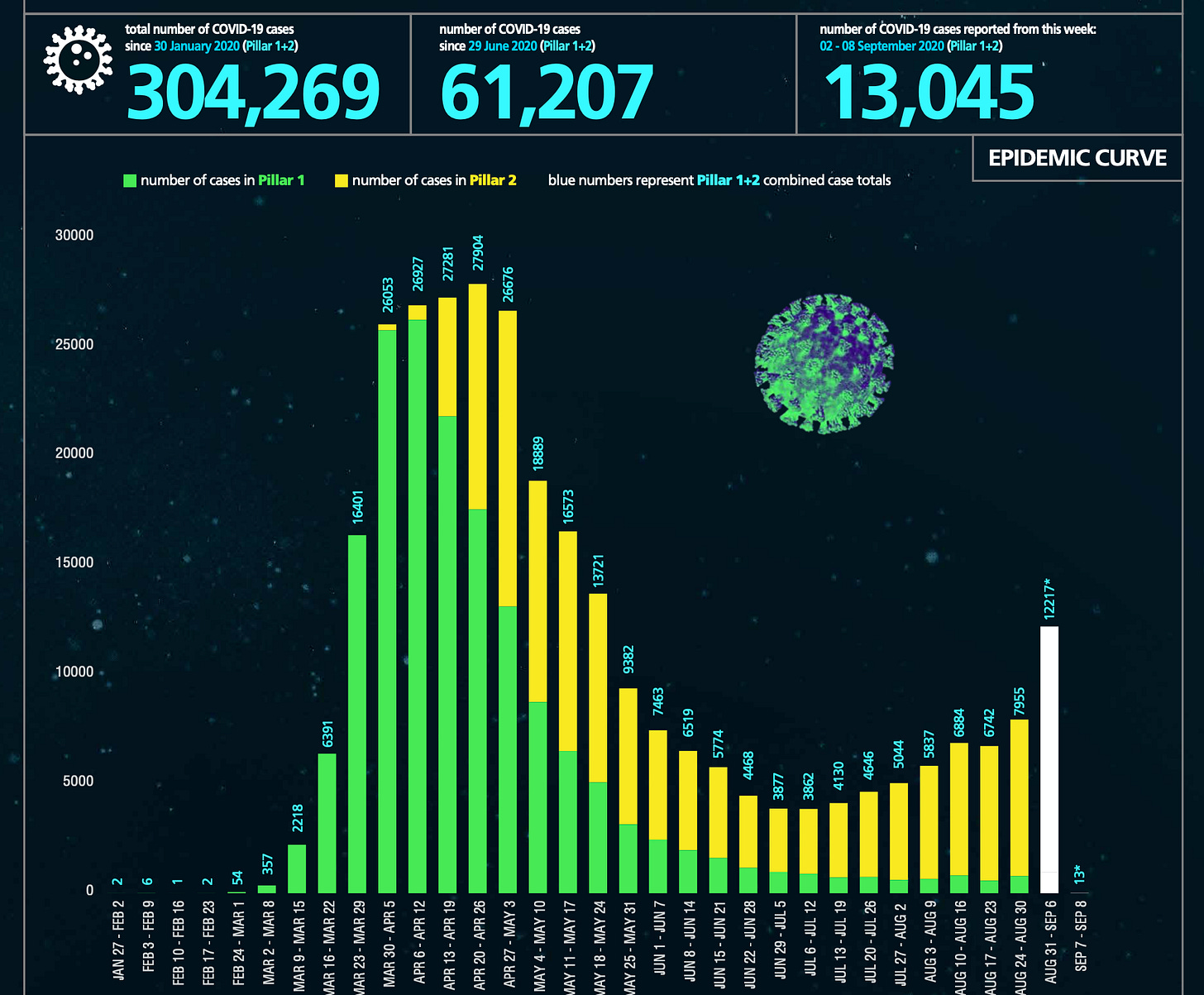
I do not know which graph the Prime Minister was shown but I did do a search for any other reports, related to Covid-19, where colour could be problematic. It took me about 30 seconds to find this doozy. Here is a screenshot of the graph used to illustrate case data in the weekly surveillance report.
I didn’t even realise there were two colours on the bars on this graph when I first looked at it.
I often have this experience. I look at some block of colour, say a bar on a graph, and it all looks the same. Then I go, wait a second, something ain’t right… I then squint a bit, try to get it in a better light, and I can then work out there is another colour there.
One of the stranger aspects of being protanopic is that I have problems with colours other than red. Often for me, the greens just aren’t green enough - it often happens that I can’t tell yellows and green apart.
Doing better
Let me point out some resources to help do this better.
There is a good article on Cancer Research UK's website about colour blindness.2 The author, Dr Andrew Porter, points out that it is actually quite an easy fix and offers various solutions and options to ensure accessibility. Porter has provided a lot of links and they are excellent resources.
A lot of the media reporting and many of other the CSO’s comments related to Johnson’s general inability to read and understand graphs. I’m not going to dwell on that.
There is an annoying error near the beginning where Porter writes: “Most common is red-green colour vision deficiency (deuteranopia), affecting around 1 in 12 men and 1 in 200 women in the UK.” It is true that red-green colour blindness is most common but deuteranopia is not the only flavour - in fact, it is not even the most common of the red-green CVDs. That’s deuteranomaly.


